Exhibit halls are often large and very crowded. With hundreds of trade show booths to contend with, how do you stand out from the crowd? Believe it or not, there are numerous ways in which you can improve your trade show booth design to stand out amongst the giants- without the need to bust your budget. With over 18 years of experience and thousands of trade show booths built over the years, we have the inside track to help you improve your trade show booth design.
Add Pops of Color Inside Your Hanging Sign
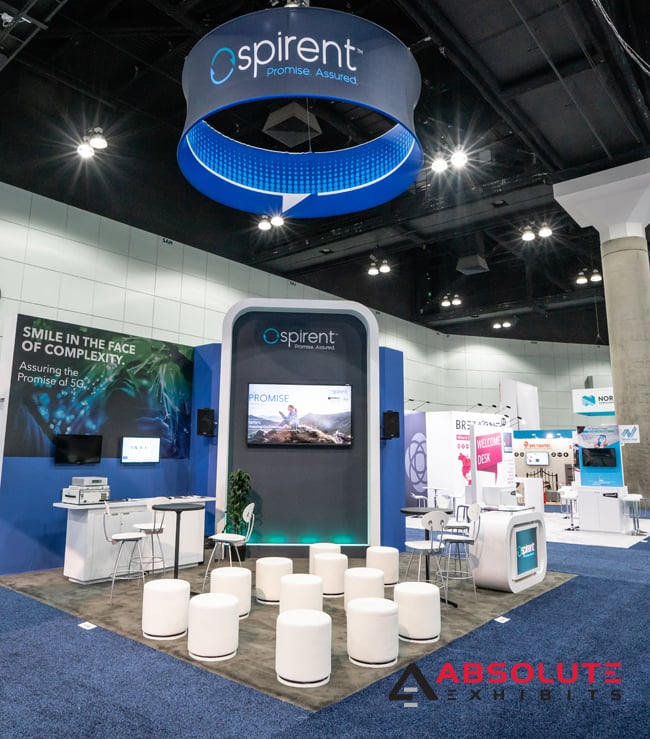
Numerous exhibitors have large hanging signs, but most of them forget about the little details such as pops of color inside that hanging sign. When considering your trade show booth design, think of how people will view your hanging sign. They may see it from numerous angles, including below or from across the exhibit hall. Why not catch their interest with some interior graphics or a repeating theme of lines of color? While it may sound expensive, the truth is this aspect of your trade show booth design is really inexpensive because the outside of the hanging sign is already being printed as well. Don’t forget that attendees can see your sign from multiple angles. Dare to be bold and different.
Light Up Your Trade Show Booth Design
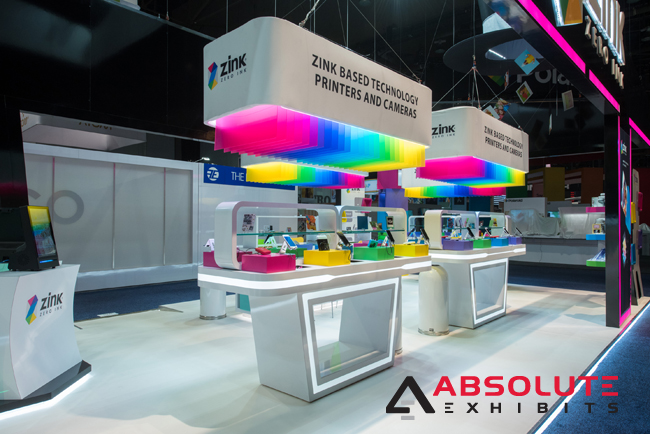
Light can play a very important factor in your trade show booth design. Whether this is interesting and different lighting options that draw the eye or a backlit graphic, light can be used to differentiate yourself from the exhibits around you. Have you tried using light in your interactive display areas? Have you tried a raised floor with lighting? You can also play with lights shining down from a bridge to highlight demonstration areas. Talk with your design partner to ensure that you get the right lighting in your trade show booth design, so you stand out.
Simplify Your Graphics
Graphics are a very important part of your trade show booth design. If you go overboard on confusing and clashing graphics, you can actually turn people away from your trade show booth. Instead, consider using a minimalistic approach to your trade show booth design. This means focusing your messaging so that graphics remain clear and don’t compete with messaging in various parts of your exhibit. Great examples of simplified graphics are those which work together, inviting attendees to take it all in as one big message, not 100 smaller message.
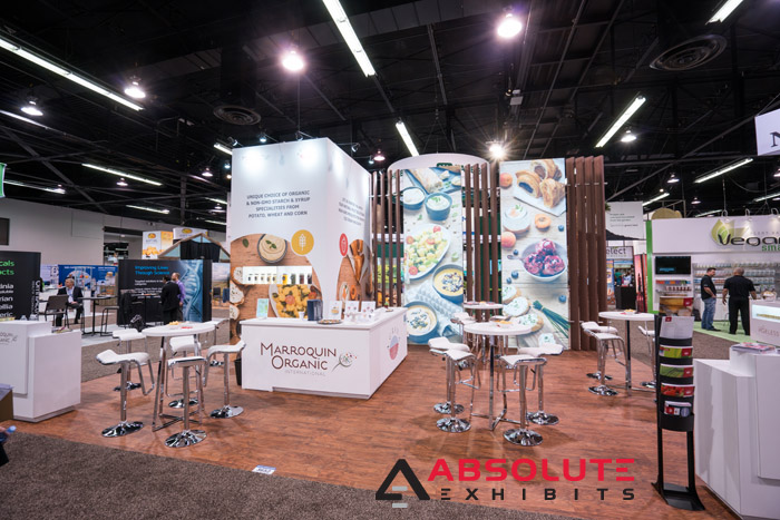
Go Green
Greenery is an often overlooked part of your trade show booth design. Everyone loves to be around calming plants and nature. This is why offices and environments across the globe include plenty of greenery. Not to mention that greenery can provide benefits such as cleaning the toxins from the air. When considering your trade show booth design, try to incorporate some plants to stand out.
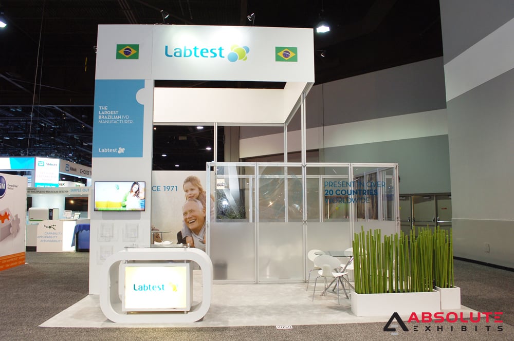
Pick a Theme
It can be scary to commit to a themed trade show booth design, but when you’re exhibiting on the trade show floor, themes attract attendees from across the exhibition hall. Consider how your brand can stand out by drawing from your history or playing with elements unique to your industry. In the world of food, this could mean building a barn or greenhouse. In the world of travel, this could be pagodas or pillars. If you’re not settled on a theme, you can collaborate with your exhibit design house partner to incorporate one into your trade show booth design.
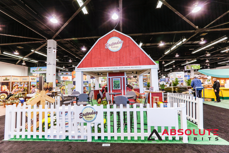
Ever wonder why you may not be attracting the foot traffic you deserve at a trade show? It could be that your trade show booth design is boring or lacking something to make people say oh, I need to see that! Try these improvements to your trade show booth design to wow people at your next show.


