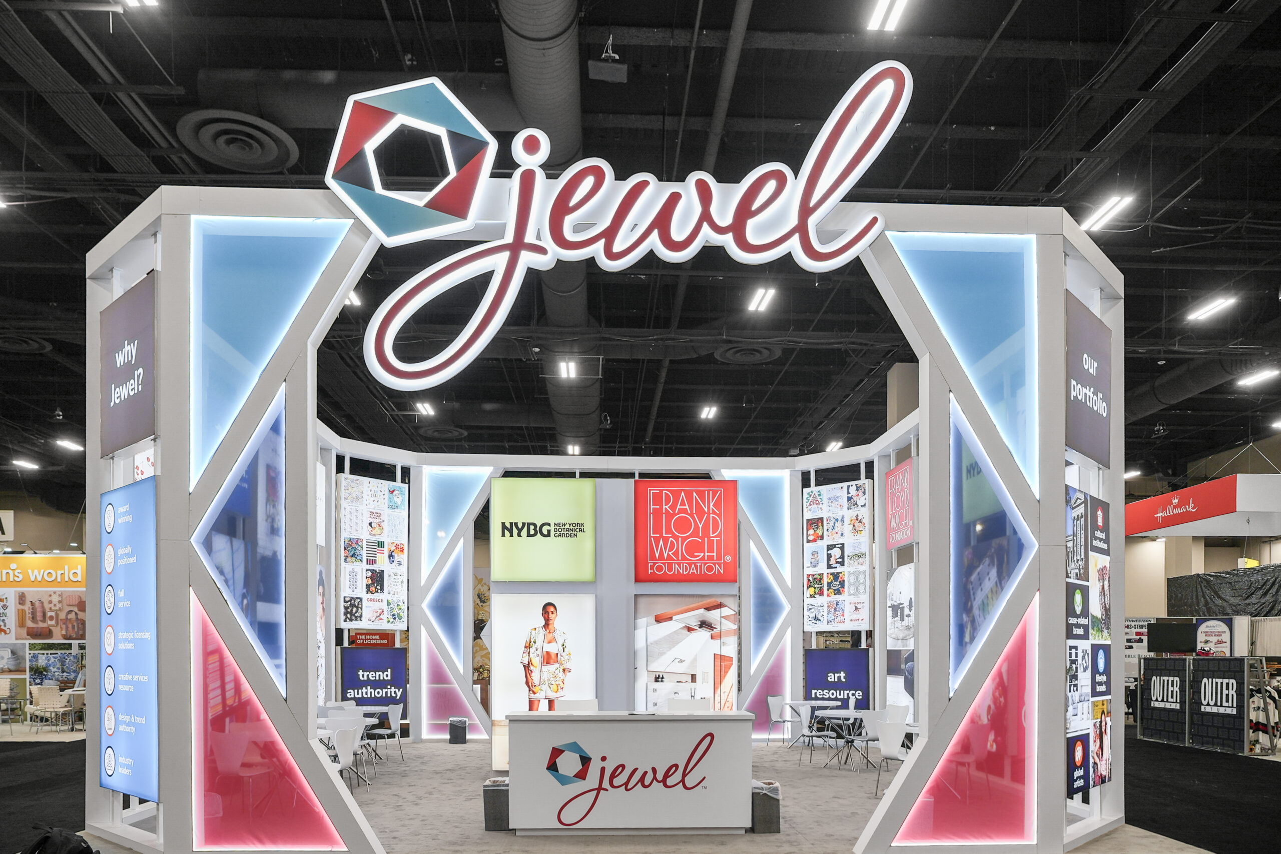
Whether your booth is a small 20×20 or a large island, every exhibitor wants to stand out. The structure may be similar to others on the floor, but what truly sets you apart is how you use color theory in trade show exhibits.

The Importance of Color in Branding
Color plays a major role in how people perceive brands. Research shows that consumers make snap judgments—sometimes within seconds—based on color choices. While general rules exist (yellow for warmth, red for excitement, green for calm), personal experiences and cultural differences also shape reactions. That’s why aligning colors with your brand identity and audience is critical.
How Color Theory Works in Exhibit Design
Designers often rely on the color wheel to create appealing combinations:
- Complementary colors → Opposites on the wheel that create contrast.
- Triadic colors → Three evenly spaced hues that feel balanced.
- Tetradic colors → Two pairs of opposites that add variety.
When used effectively, these combinations highlight your brand and prevent clashing visuals that can overwhelm or turn off attendees.
Color Psychology and Trade Show Exhibits
Beyond theory, color must connect with your brand personality:
- Bold brands → Bright, daring colors like orange or electric purple.
- Technical brands → Sleek tones such as blue, gray, or silver.
- Natural brands → Earth tones, greens, and warm neutrals.
Cultural awareness matters, too. For example, red is a lucky color in China, but in other markets it may feel aggressive. Knowing your audience ensures colors resonate instead of repel.
Real-World Examples

A Polaroid booth at CES used a kaleidoscope of colors to convey fun and whimsy.
At Black Hat, tech companies leaned into purples, blues, and pinks for a futuristic edge.


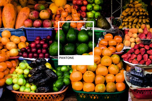
Pantone’s yearly color trends often influence exhibit design, with Ultra Violet once setting the tone for inventive, imaginative displays.
Checklist: Using Color Theory in Trade Show Exhibits
- Define your brand personality (bold, rugged, natural, technical)
- Choose complementary or triadic color schemes
- Align colors with your target audience’s culture and expectations
- Keep messaging and graphics simple to let colors shine
- Monitor color trends for inspiration without losing brand identity
Final Thoughts
Color is more than decoration. It’s strategy. By applying color theory in trade show exhibits, you can influence emotions, attract attention, and create stronger connections with your audience. As Absolute Exhibits has seen with clients, thoughtful color choices often determine which booths attendees remember long after the show.


