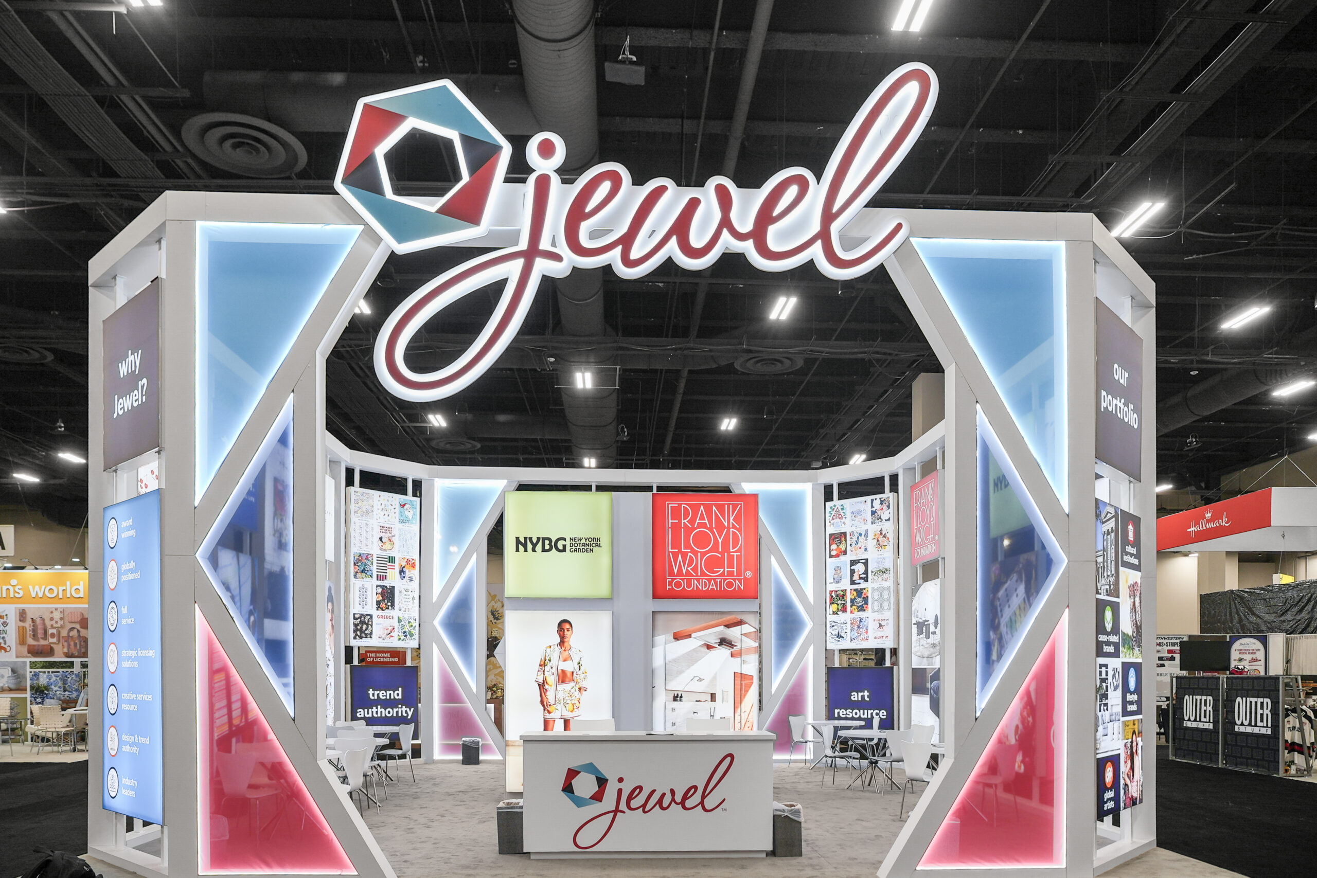
Poor graphics on a booth is a pet peeve of mine. I’ve been doing the trade show gig for decades and it never ceases to amaze me that a few exhibitors get it totally right but most blow it. Here’s a few “TRADE SHOW NO-NOS”:
Keep it stupid simple. Maybe 3 short bullets, and use pictures, but not complicated diagrams. DON’T USE THE GRAPHIC AS A REPLACEMENT FOR YOUR SALES/BOOTH PERSONNEL!
There’s so much graphic confusion…..it gives me a giant headache…I want to run away!
What in the heck are you selling? This is a question we often ask ourselves when touring a show and stopping at a booth. What is this guy selling? What does it mean to “Blur the line?”
Here’s a better example, Valplast. “Flexible Partials”….”Flexibility is our Strength.” Its easy to get it. No need to study the booth. No need to figure out what you’re selling. Make sense?
Look at the “Bags…..For Generation Mobile” photo. I get it……it’s for people on the go, I’m sure very stylish……
Then the worst violation of all is no signage or pathetic ones. We’ve seen several examples at shows where graphic artist must have taken a vacation…..or the crate didn’t show up. Here’s a picture of portable saunas (I think). Imagine the poor fellow manning this booth!
And this is the top-winner-of-bottom-level-graphics. This was seen at one of the biggest shows on earth, the 2009 Vegas CES show in South Hall. Someone needs to be looking for a job at this company!
Hope this helps. These are all examples of trade show NO-NOs. Please make a note of it!


