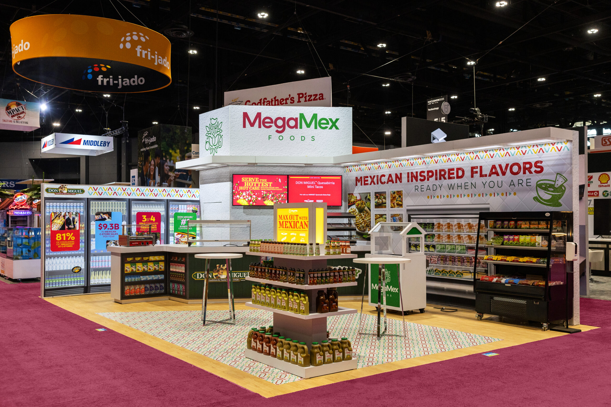
When it comes to designing your 20×30 exhibit, it can be daunting trying to come up with an idea. Depending upon the show and the industry, it can feel a little overwhelming at times. That’s why we’ve put together a number of great design ideas for your 20×30 exhibit. Before you meet with your exhibit design house partner, consider some of these great design tips:
Build Up, Not Out in Your 20×30 Exhibit
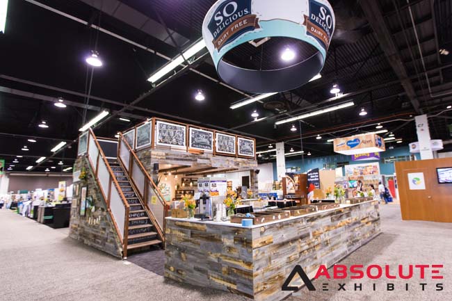
When it comes to designing a 20×30 exhibit, it can feel a little awkward trying to maximize your space. Often, brands want to showcase their products, have giveaways or demonstrations, but they also want a space to meet with prospects or current clients. That’s why we recommend building up instead of out. While you should certainly maximize your entire booth space, it’s also helpful to gain the extra space with a double decker exhibit. This allows more space to decorate, design, and to provide a meeting space. Consider how much more comfortable you’ll be meeting with people on top of your 20×30 exhibit and how much more private this will be with visitors wandering in and out of your exhibit below.
Modernize Your Structure
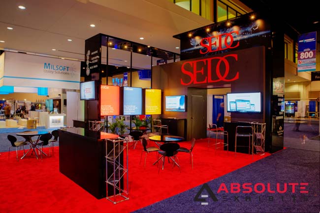
In a 20×30 exhibit, the tendency is to want to fill it with more design options. However, if you keep your design modern and sleek, you can maximize the space that trade show attendees can use. You can still achieve a beautiful looking exhibit by using arches, bridges, and backlit signage. All of this will allow more space for attendees to visit your exhibit and learn more about your goods and services. By cluttering your booth space with too many items, you may actually deter people from visiting you. The key is to maintain an open floorplan where people can interact with you.
Create a Product Wall
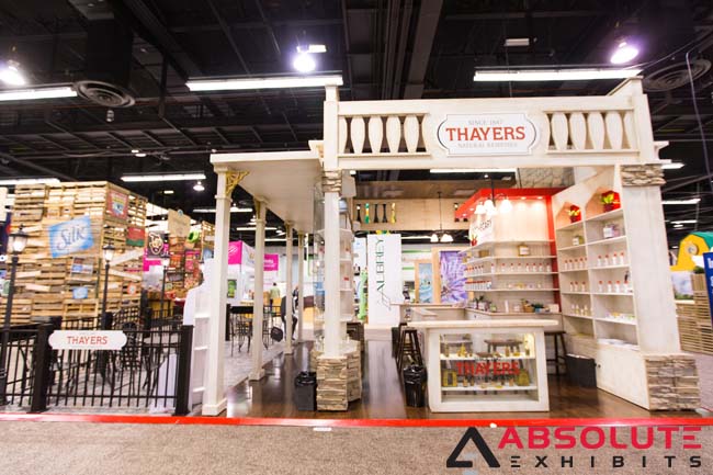
Depending on the nature of your product, you may want to create a product wall in your 20×30 exhibit. This allows you to keep the focus on your product without the need for multiple stands and display cases. A product wall can make your product the star of the show and actively encourage conversation with trade show attendees. If this is a food or beverage item, you can serve your products with a bar. If this is a machinery item, you can let attendees pick up your product and examine it. A product wall is just a great way to make your product the star of your exhibit.
Open Up Walls of Your 20×30 Exhibit
By opening up walls of your 20×30 exhibit, a busy themed exhibit can still encourage more traffic to your booth space. In many cases, exhibitors who have chosen themed exhibits attract so much attention across the trade show floor. However, if they don’t have open walls to allow traffic to flow into that structure, they may be deterring people from visiting. That’s why it’s so important to open up the walls of your structure to let people come in and view your products.
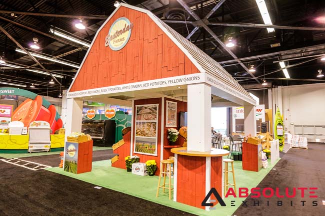
When it comes to designing a 20×30 exhibit, there are many ways in which you can approach it. Depending upon your industry and your products, you may want to use one of these ideas or more. For specific help, contact your Absolute Exhibits Account Executive who can help you develop a design that meets your 20×30 exhibit needs best.


