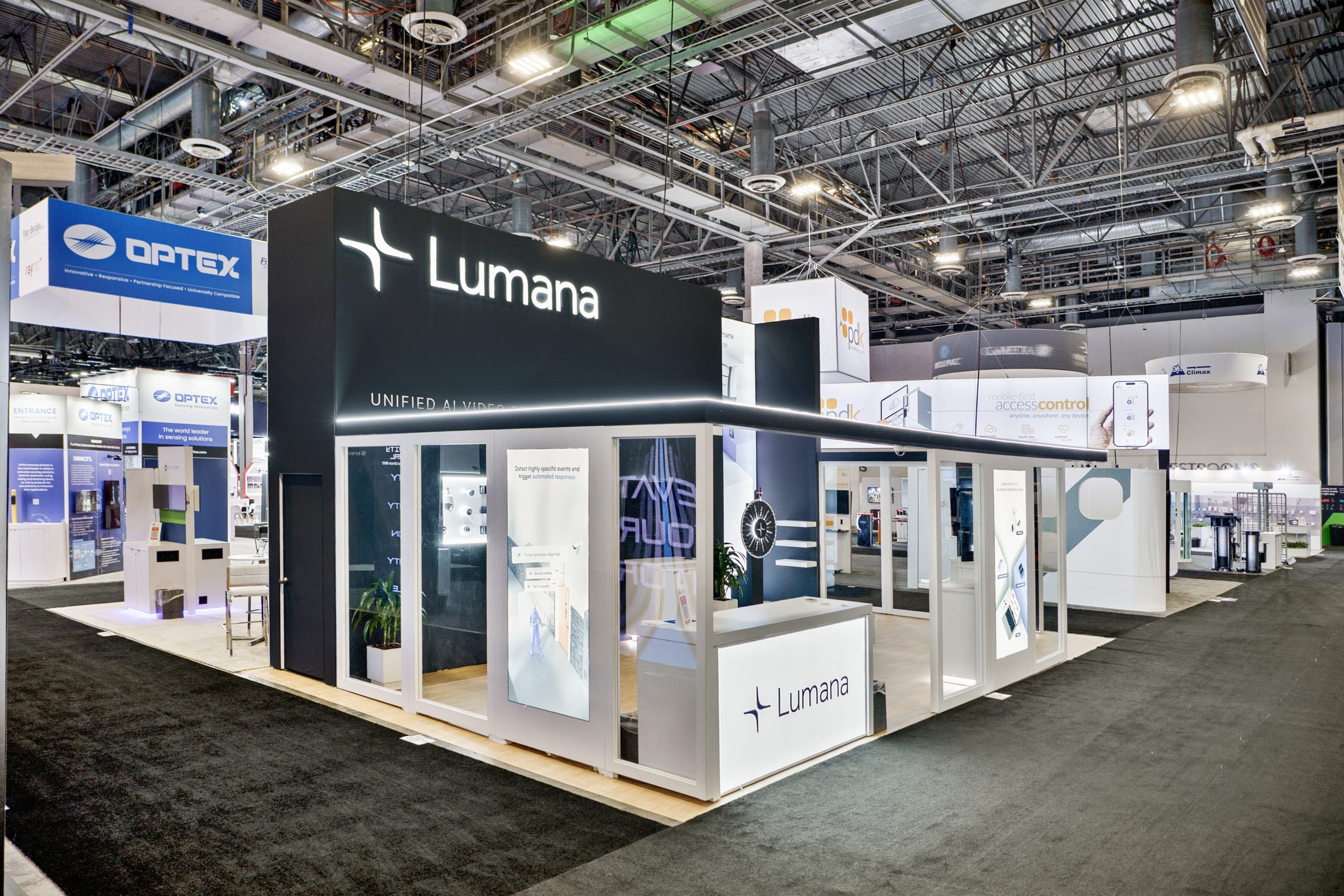
On the show floor, your graphics have only seconds to grab attention. Clean, professional graphic design for your trade show booth tells attendees that your brand is credible and worth their time. Sloppy or cluttered graphics send the opposite message and can cost you valuable booth traffic.
First Impressions Count
Attendees often judge your booth the way they judge retail stores. A booth with handwritten signs or low-quality prints feels unprofessional, like a flea market stall. In contrast, crisp graphics and polished finishes feel like a brand worth trusting. If your booth looks complete and intentional, people are more likely to step inside.

Use Large Visuals, Not Clutter
When it comes to graphics, bigger is usually better. Replace a wall of small product shots with one oversized image that communicates your story instantly. For example, if you sell tools, a single eight-foot hammer makes a stronger impact than dozens of 8×10 photos. Oversized visuals draw the eye from across the aisle and reduce information overload.
Keep Text Short and Clear
Trade show attendees move quickly and won’t stop to read long paragraphs. Limit text to a short headline and no more than 4–7 bullet points in your collateral. Focus on benefits, not technical specifications. For example:
- Save time
- Reduce costs
- Improve efficiency
These short, clear points make your value obvious in seconds.
Add Impact with Backlit Graphics
Lighting can make or break your booth. Backlit graphics add depth and create a glow that stands out in crowded halls. While they cost more, they can be worth the investment for key visuals, product launches, or brand messaging you want to highlight.
Think Like a Billboard
Trade show graphics function like billboards on a highway. Attendees pass by quickly, so your design must be bold, simple, and instantly clear. Use large visuals, minimal text, and strong contrast. Then, edit ruthlessly. A good way to test clarity is to show your graphics to someone outside your team—if they don’t understand the message in five seconds, simplify further.
Trade Show Graphic Design Do’s and Don’ts
Do
- Use bold, oversized visuals
- Limit text to a headline and short bullet points
- Focus on benefits, not specs
- Invest in backlighting for key graphics
- Test messaging with outsiders before printing
Don’t
- Use handwritten or poorly printed signs
- Overload walls with small photos or long copy
- Make your company name the only focus (unless you’re a household brand)
- Choose busy backgrounds that make text hard to read
- Skip proofreading—typos kill credibility
Final Thought
Effective trade show graphics design is about clarity, not complexity. By using bold visuals, short text, and professional finishes, you increase the odds that attendees will stop, engage, and start a conversation. Absolute Exhibits has worked with clients to design graphics that elevate their brand and stand out on any show floor.