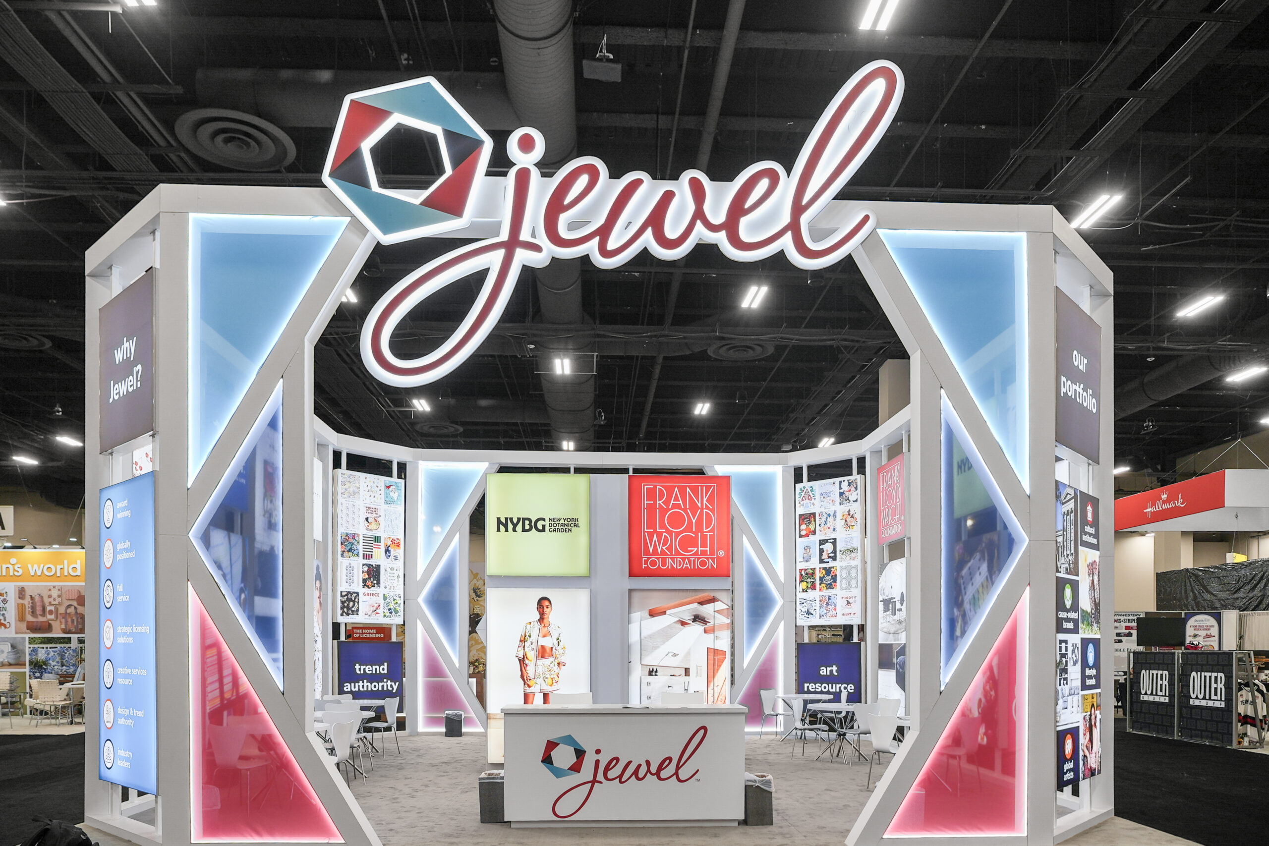
The importance of color in the design of a trade show booth and its graphics cannot be over-emphasized. To continue their branding ethic, most companies follow their corporate colors or identity. Color appeals to emotion, creates feelings, and causes humans to react in certain ways – whether obviously or subliminally. If your company colors are red and white – should you choose gray or black to compliment your identity? On the other hand if your company identity is black and gray – should you stay with just those colors or add something eye-catching to get you noticed?
Here are some basic colors and how they have an effect on us – and consequently how they affect trade show attendees when they view your trade show booth and its design:
Red – an emotionally stimulating color that promotes flight of the imagination; women are drawn to blue-based red while men prefer yellow-based red
Blue – provides a soothing effect and promotes fantasy; blue is generally not the best for a high-powered campaign that needs to generate energy
Yellow – the number-one attention grabber that if over-used can cause viewer irritability
Green – creates an atmosphere of comfort for attendees in unfamiliar surroundings and is associated with nature and money
Black – represents power, authority, and dominance
White – portrays purity, decency, and honesty
Gray – enhances creativity but can be perceived as grubby or dirty
Brown – construed as informal and comfortable
Silver and Gold – indicate top-of-the-line products


