The 20×20 trade show booth is one of the most common booth sizes across industries. It’s large enough to establish presence but small enough to stay efficient. Still, exhibitors often ask how to make this footprint feel larger and more inviting. With smart design choices, you can create a booth that looks expansive and draws more traffic.
Build Up, Not Out
Cramming too much into a booth makes it feel crowded and uninviting. Instead, build vertically. A 20×20 trade show booth is an excellent candidate for double-deck designs. An upper level can serve as a semi-private meeting room or a viewing platform with video displays. Going up adds usable space without shrinking the footprint.
Use Lighting to Expand the Space
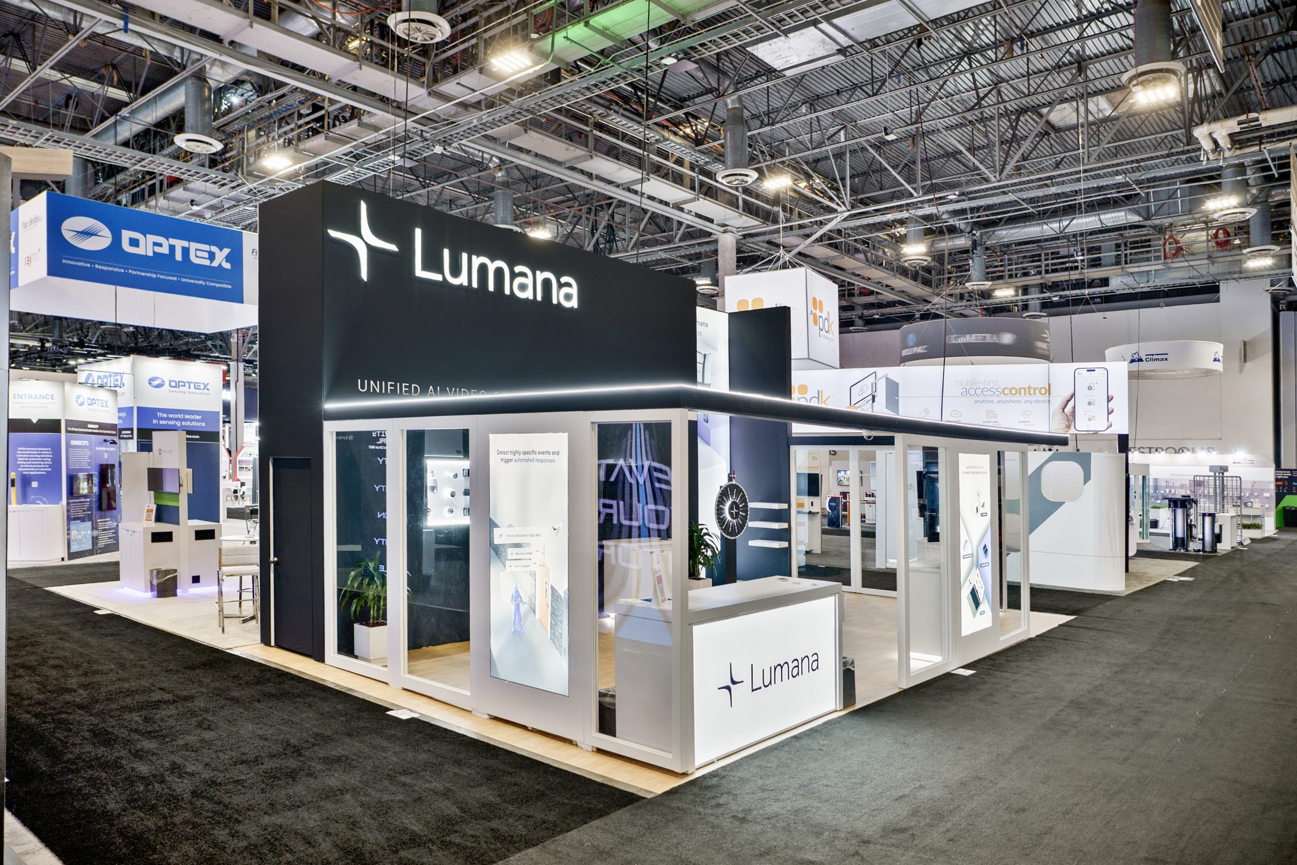
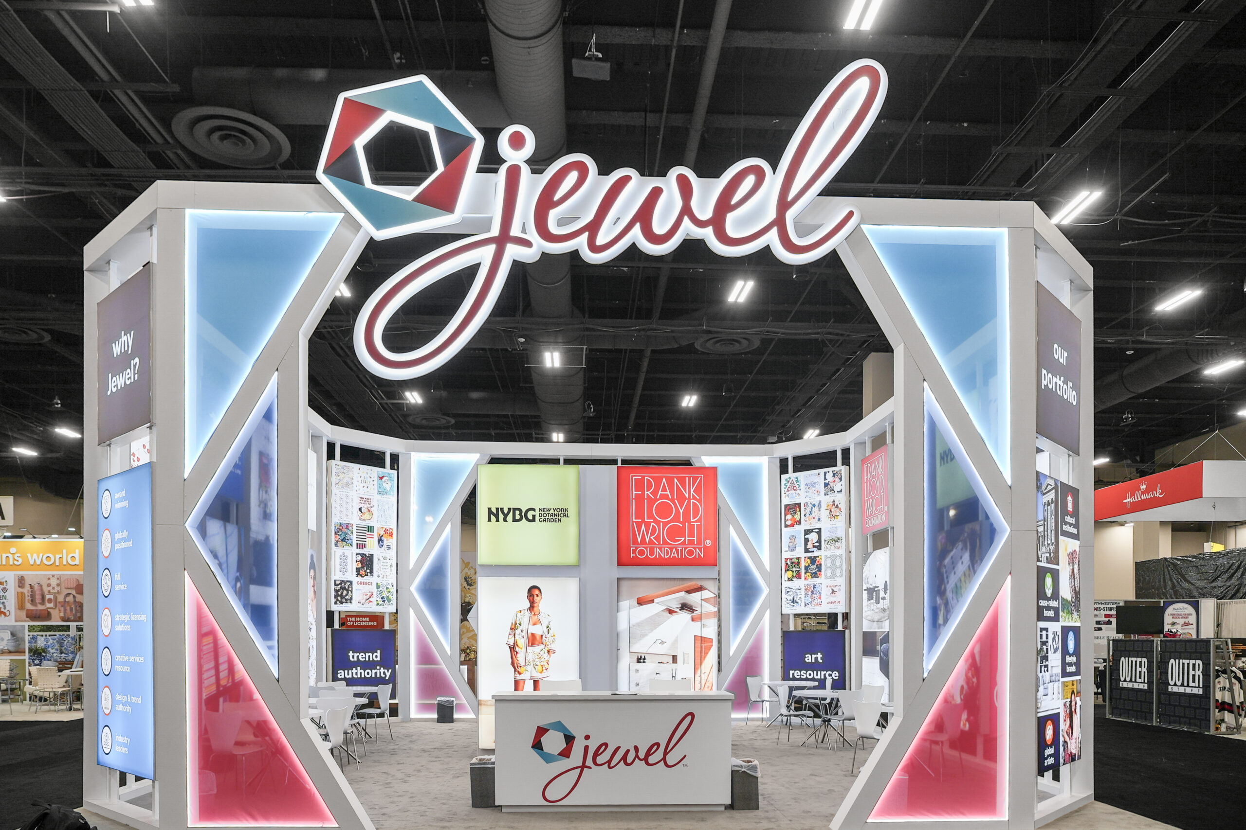
Lighting can make a booth feel bigger—or smaller. Bright, strategic lighting draws the eye outward and makes a 20×20 trade show booth seem larger, while dark, uneven lighting can close it in. Accent lights, color effects, or illuminated signage all create an open, welcoming environment. Exhibit design experts can guide you to options that maximize space perception.
Prioritize Traffic Flow
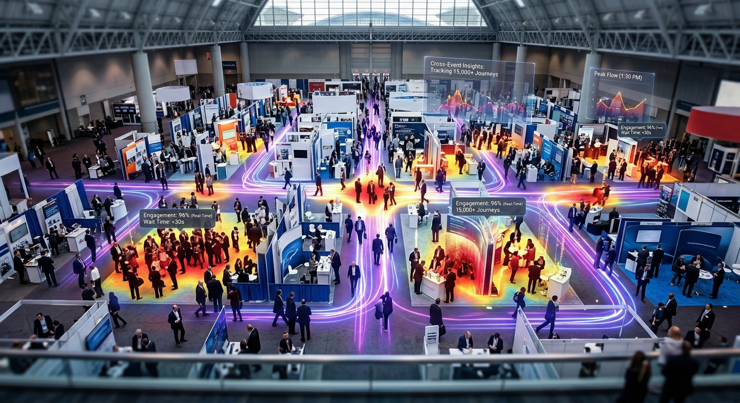
Negative space is as important as filled space. Clear walkways, open corners, and multiple entry points keep the booth comfortable and easy to navigate. Designing for smooth traffic flow ensures your 20×20 trade show booth feels bigger and prevents bottlenecks that turn attendees away.
Add Inviting Technology
Technology attracts without overwhelming. Touchscreens, VR or AR demos, and gamification elements add excitement while staying compact. These tools provide engaging experiences in discreet, space-saving formats. Instead of cluttering the booth with large installations, technology helps your 20×20 trade show booth feel open and modern.
A 20×20 footprint can be just as impactful as larger exhibits with the right strategy. Vertical builds, smart lighting, open traffic flow, and discreet technology all contribute to a bigger, more inviting feel. Absolute Exhibits works with clients to design trade show booths that look expansive, engage attendees, and generate measurable ROI on the show floor.
Checklist: 4 Ways to Make a 20×20 Trade Show Booth Feel Bigger
- Build up – add double decks or vertical elements.
- Use lighting – brighten and expand the perceived space.
- Plan traffic flow – leave negative space for movement.
- Incorporate technology – add excitement without clutter.


